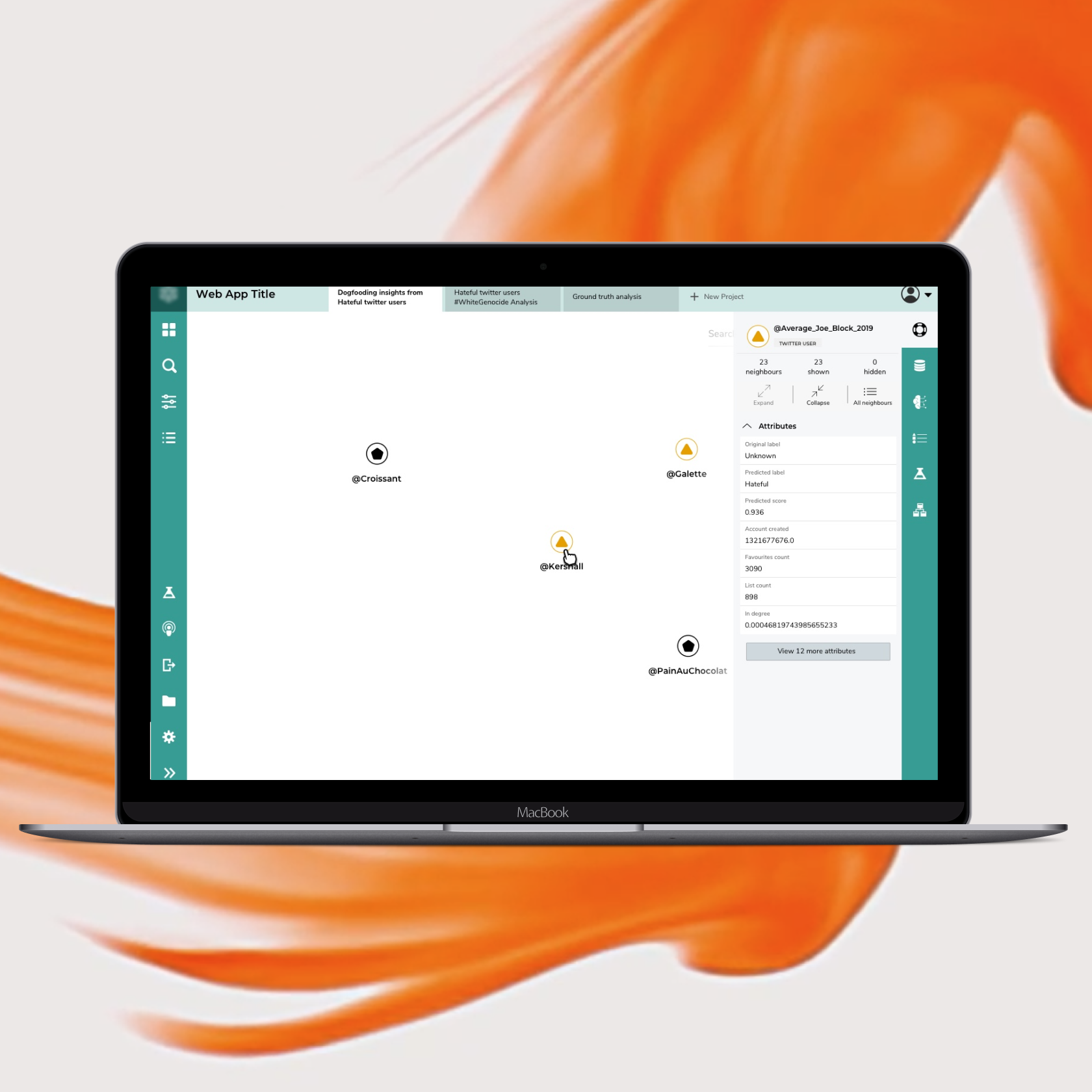
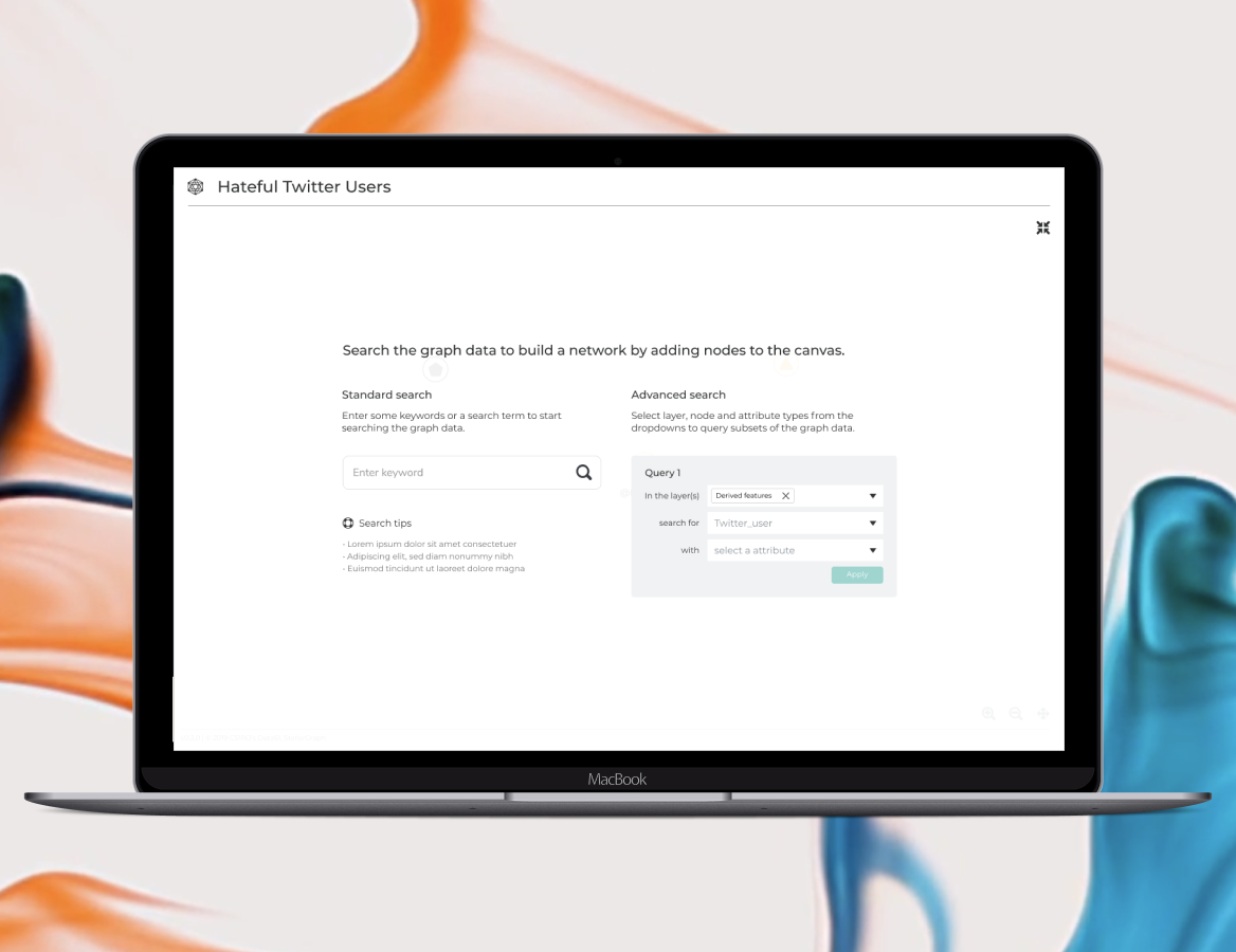
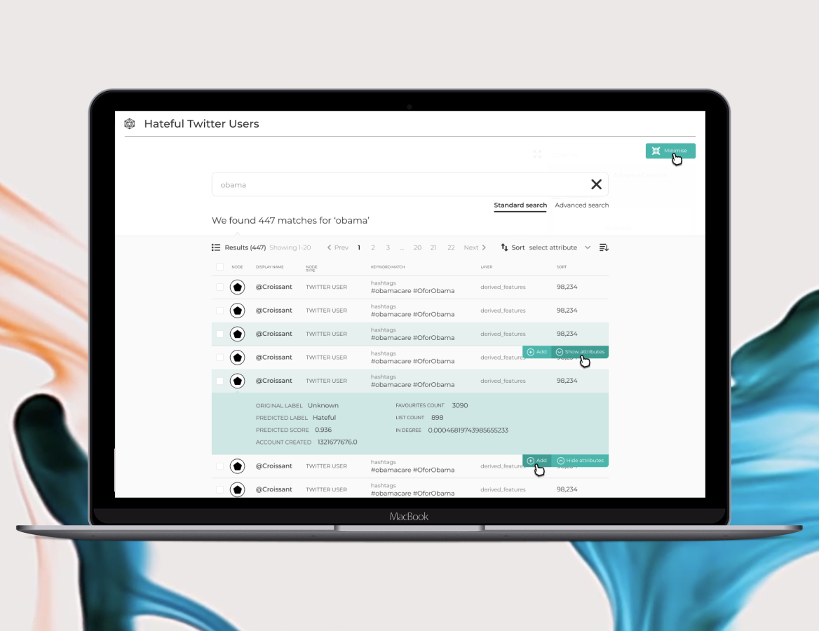
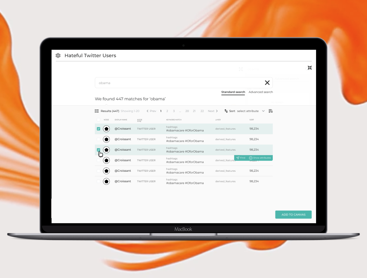
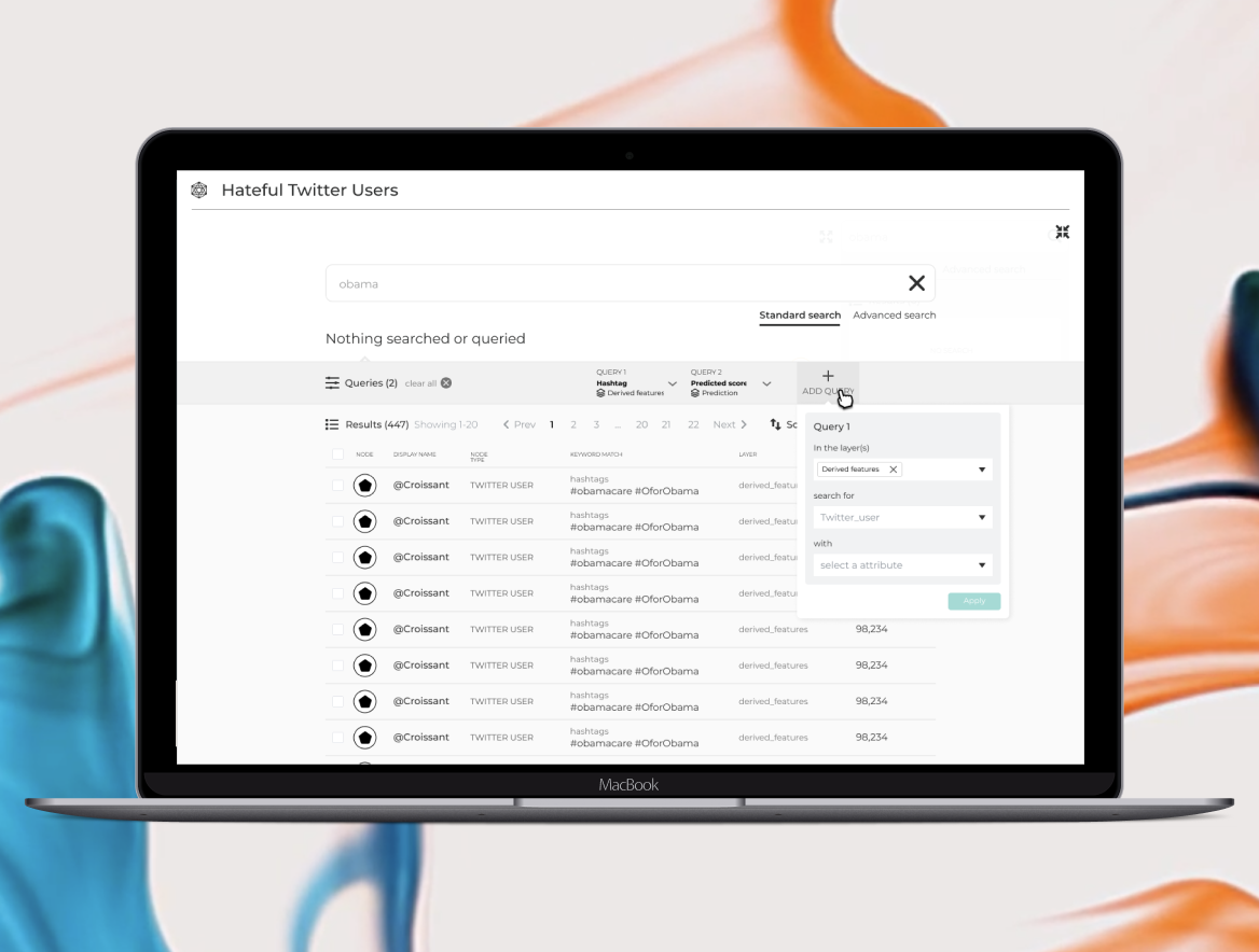
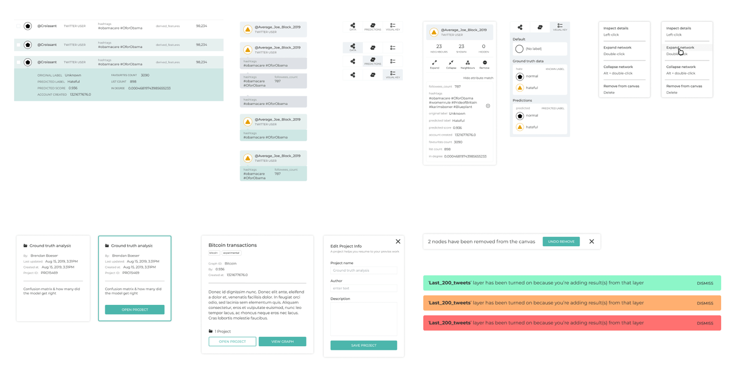
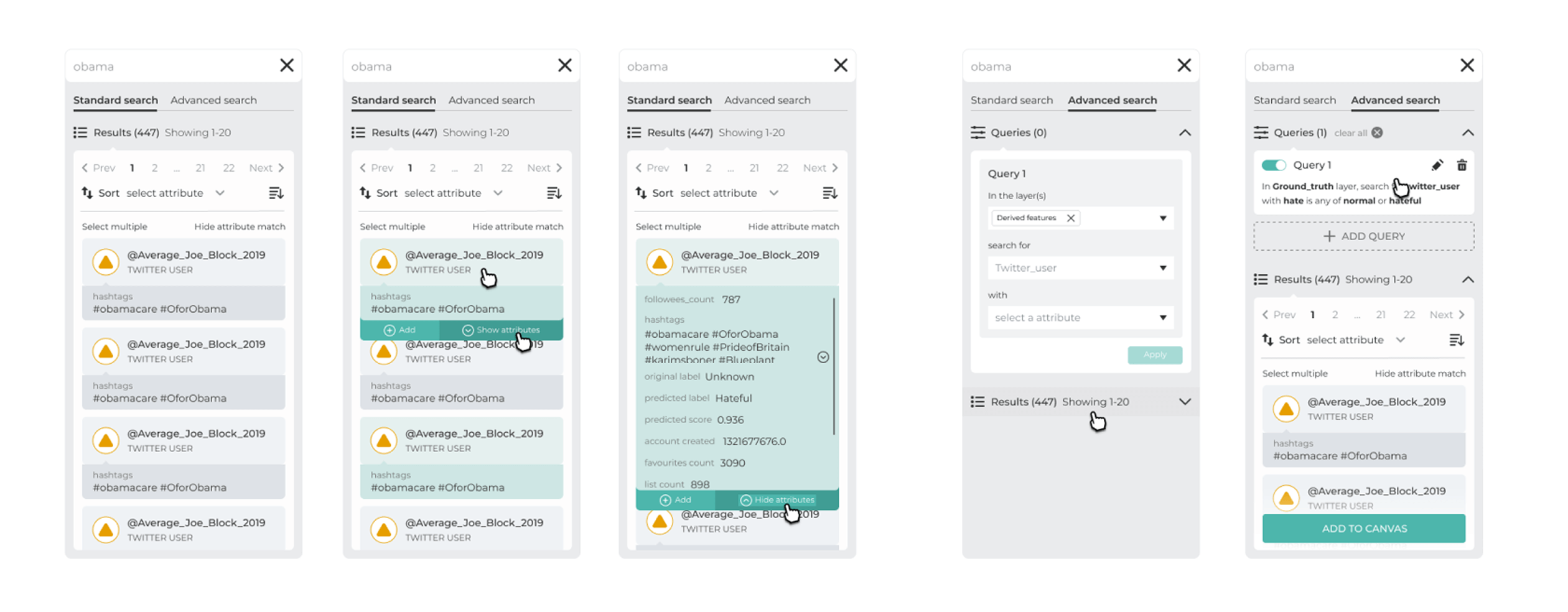
Within Figma I created collapsible filter panels, contextual legends, and standardised node states to ensure visual consistency across the application. Each component was built as a nested, variant-driven asset so product teams could toggle properties without duplicating frames. I then linked the screens into an interactive prototype that used Smart Animate, timed micro-interactions, and gentle easing curves, allowing researchers to preview hover, focus, and multi-selection behaviours in a way that closely mirrors the final coded experience.
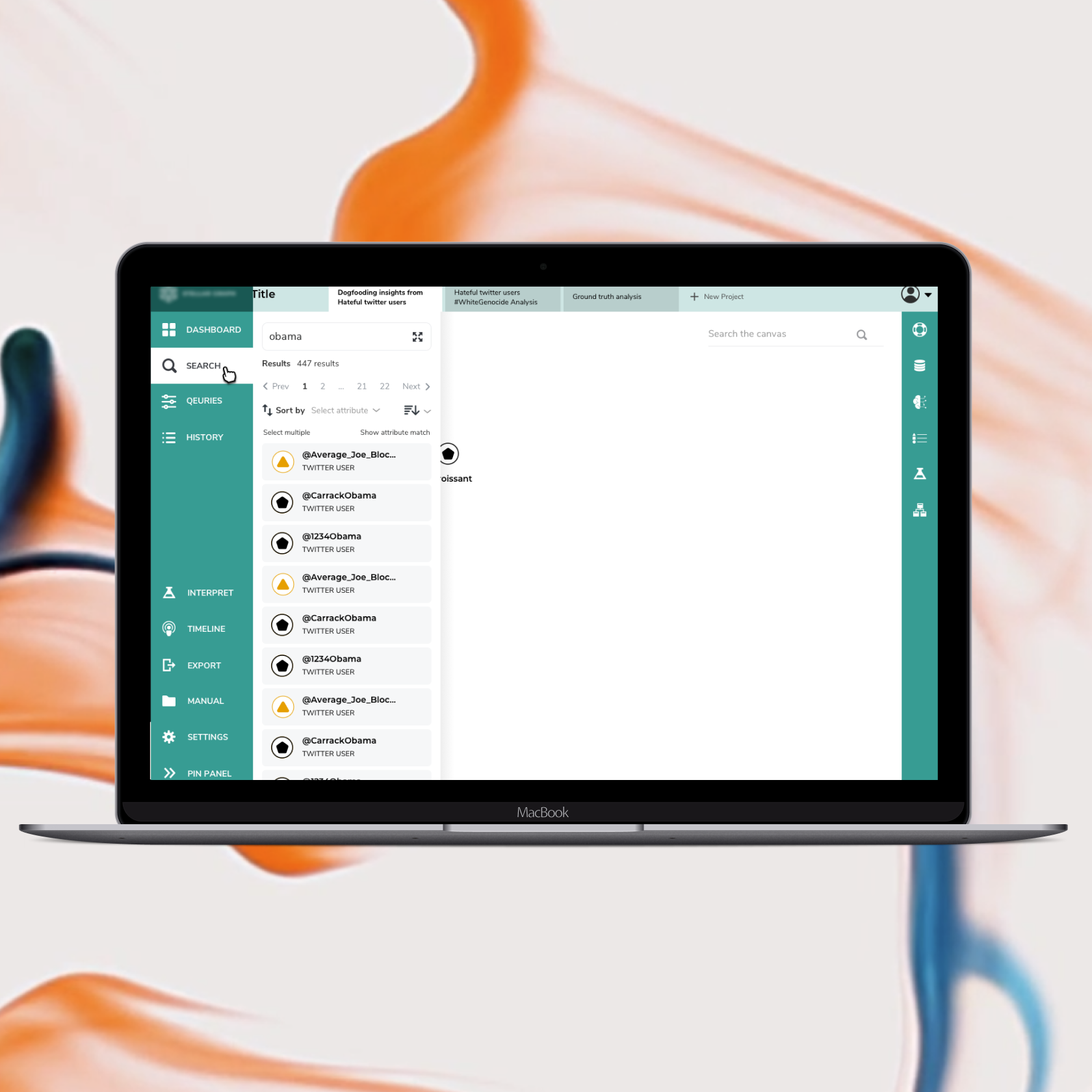
CSIRO/Stellargraph
StellarGraph is an open-source Python library that lets teams build and deploy cutting-edge graph-based machine-learning models, like node embeddings and graph neural network, through a simple, high-level API.
PROJECT
UX Review & IA Update
DATE
June 2019 – October 2020
SERVICES
UX Design, SaaS, Web App, Information Architecture
Overview
StellarGraph’s network-analysis tool overwhelmed researchers with scattered controls and limited guidance.
The goal was to improve the experience for first users so they are greeted with useful information on how to use the product and so they can understand how to search and use the advanced search query features. There was also an additional need to reimagine its UI structure for clarity and future-proof it for new features.
Discovery & Research
The project’s aim was to overhaul the first-time user experience so newcomers are greeted with clear, value-driven guidance that explains the product’s purpose, walkthrough tips for basic actions, and a concise tutorial on using the advanced search query builder.
In parallel we audited the existing navigation, information hierarchy, and visual patterns, then rebuilt the interface with cleaner labelling, more intuitive grouping, and reusable components. This approach reduces time to value for new users and establishes a scalable UI framework that can accommodate additional features without costly rework.
Strategy & Ideation
During the early ideation phase I generated three divergent sets of low-fidelity wireframes, each exploring a distinct information-architecture pattern. The sketches tested how primary actions and global filters would perform when anchored in a persistent header versus a left-hand sidebar.
We converged on a hybrid solution that marries a modular sidebar for high-frequency workflows with a slim top-navigation bar for global utilities, creating a scalable framework that groups related functions logically and supports progressive feature roll-out.
Design & Prototyping
Modular sidebar
Instant user access to high-value actions while freeing screen real estate for core content.
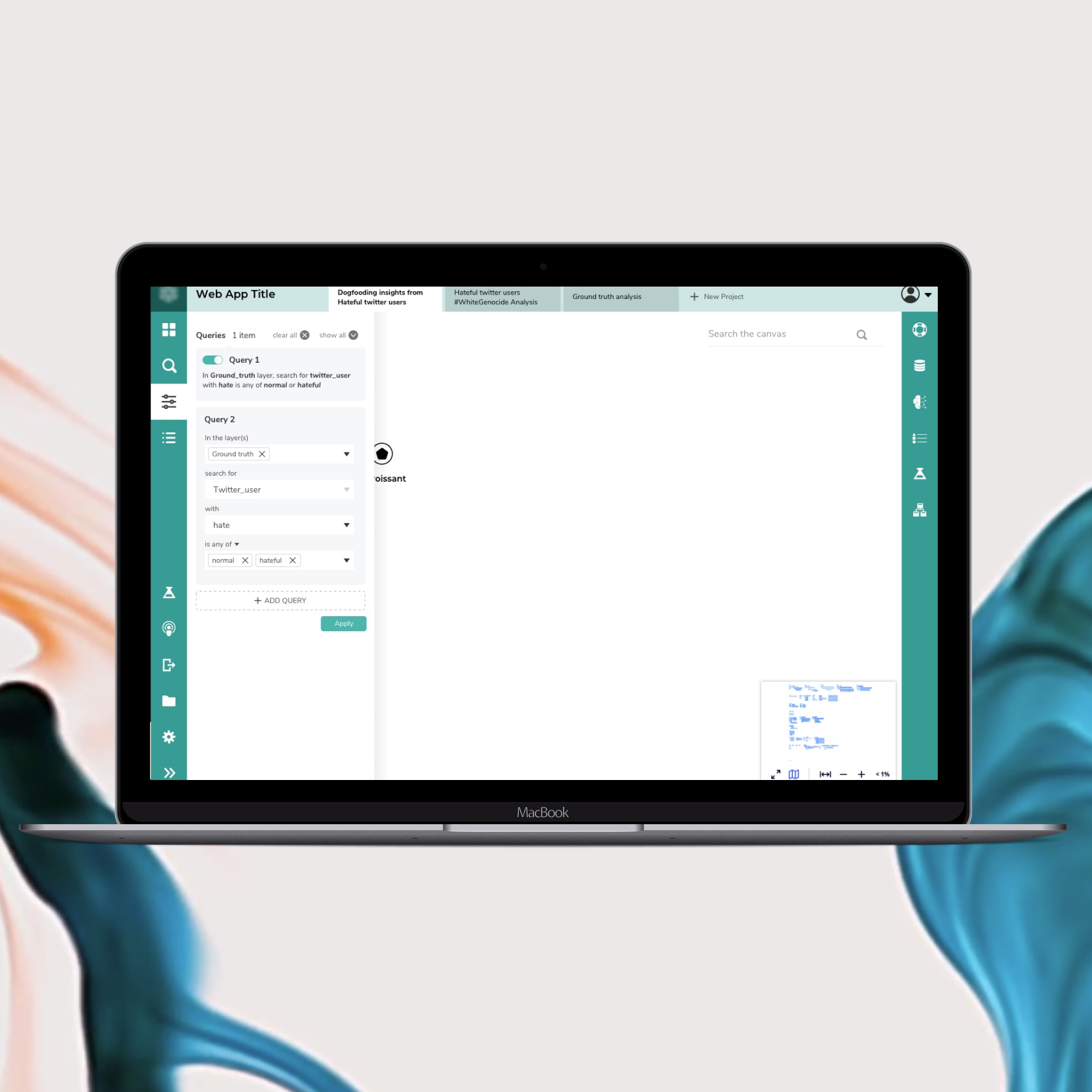
Enhanced prototype
Clickable, high-fidelity prototypes that mirror live behaviour, animation, and edge-case flows.
Interactive onboarding
Guided walkthroughs, tooltips, and progress cues that shorten time-to-value for new users.